My final front cover compared to my preliminary college magazine front cover:
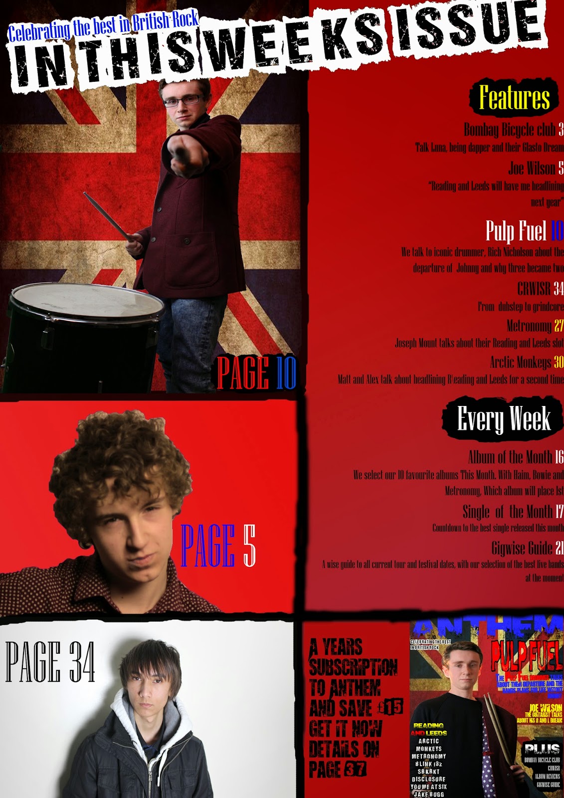
Here is my final contents page compared to my preliminary college magazine contents page:
From the progression from the preliminary task to the final product, I feel I have learnt a lot about the conventions of music magazines. On the final product I have put the main image in a suitable place so that there's enough room for other conventions, such as text. his is something I have not done on my college magazine. I have also put the teller in the right place this time. On my college magazine I put the teller at the bottom. This is very unconventional for a magazine (a college or music magazine) because it does not catch anyone's eye when it's at the bottom of the page. I have also learnt of how to pick a suitable colour scheme.
On my preliminary task the only colours I used were blue, purple (which are very similar) and yellow. The lack of colour made the contents page and front cover extremely boring to look at. There is also a complete lack of detail on my preliminary task.
One major difference for me when making my final product was that I fully planned my music magazine. For my college magazine I had drawn a draft by hand and made a quick digital mock up in five minutes on Microsoft word without any research. When creating my final product I found that researching into existing products was incredibly useful and making several drafts by hand and on Photoshop really helped.
This is an example of a draft made on Photoshop:


No comments:
Post a Comment