I have used a variety of appropriate fonts in order to make the magazine look interesting on the face of it. I have also used an image that fits with my ideology. I have made sure all of the essential conventions for a front cover are on it.
Friday, 11 April 2014
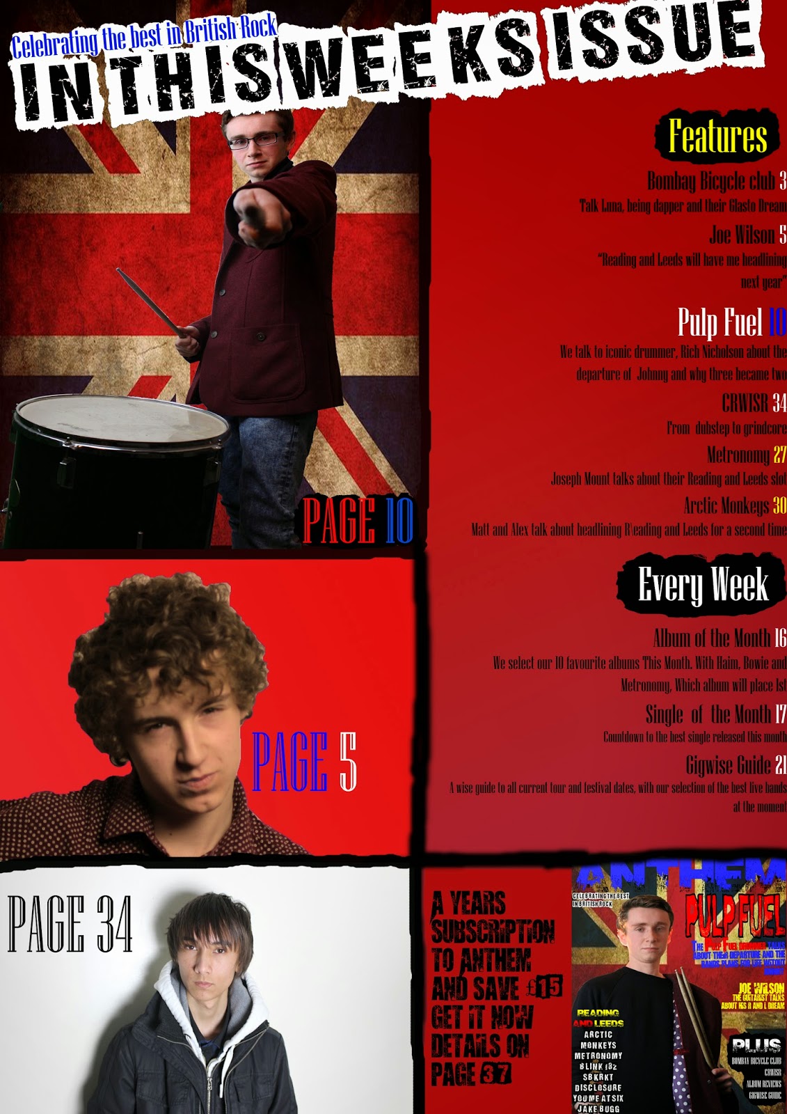
Final Contents Page
Here is my final contents page. I have tried to make this look clear and therefore make sure the reader can find everything. I have also tried to make sure enough detail is featured so that the reader is drawn into reading the articles featured.
Final Double Page Spread
Here is my final double page spread with a full written article. I have based my design on the one featured in Q magazine that I have put on this blog.
Thursday, 10 April 2014
Evaluation Q7
Looking back at your preliminary task, what do you feel you have learnt in the progression from it to the full product?
My final front cover compared to my preliminary college magazine front cover:
My final front cover compared to my preliminary college magazine front cover:
Here is my final contents page compared to my preliminary college magazine contents page:
From the progression from the preliminary task to the final product, I feel I have learnt a lot about the conventions of music magazines. On the final product I have put the main image in a suitable place so that there's enough room for other conventions, such as text. his is something I have not done on my college magazine. I have also put the teller in the right place this time. On my college magazine I put the teller at the bottom. This is very unconventional for a magazine (a college or music magazine) because it does not catch anyone's eye when it's at the bottom of the page. I have also learnt of how to pick a suitable colour scheme.
On my preliminary task the only colours I used were blue, purple (which are very similar) and yellow. The lack of colour made the contents page and front cover extremely boring to look at. There is also a complete lack of detail on my preliminary task.
One major difference for me when making my final product was that I fully planned my music magazine. For my college magazine I had drawn a draft by hand and made a quick digital mock up in five minutes on Microsoft word without any research. When creating my final product I found that researching into existing products was incredibly useful and making several drafts by hand and on Photoshop really helped.
This is an example of a draft made on Photoshop:
Comparison Of Preliminary Task And Final Product Feedback
Can you tell which is the preliminary task and which is the final product?
Magazines are different with different audiences in mind, first appears to publicise the college and possibly be an internal news magazine. Second looks to be a serious publication from a professional publisher and is much more intricate in its design.
The second appears to be the final product.
Can you tell what audiences are meant to be targeted by each of the magazines? if so what?
1) potential new students attracted to the college, particularly those with an interest in music
2) serious music enthusiasts with an existing knowledge, those with an interest in the artists mentioned
What would you say the purpose of the magazines are?
1) internal music news and to publicise music at the college
2) a serious music magazine with articles about the bands mentioned
Can you see any improvement(s) between the two? if so what?
second magazine has a definite style and feel appropriate to its target audience, much more stylised as if designed for the audience
Feedback by William King.
Evaluation Q6
What have you learnt about media technologies from the process of constructing this media product?
I have used a lot of technologies to be able to create this media product. Some of these technologies I was already familiar with such as Google and word programmes however, there were some technologies I was not familiar with such as photo editing software and handling cameras.
I needed Google for the creation of my magazine mainly for research. By searching for magazines I was able to look at styles of lots of different magazines without actually having to buy anything.
I also needed the internet to be able to use Blogger. Blogger enabled me to be able to document any thought process I had regarding my magazine. I also documented all of my planning into blogger so I could easily find it. By putting it on Blogger it enables others to view it, which is useful because those who see it can give me feedback.
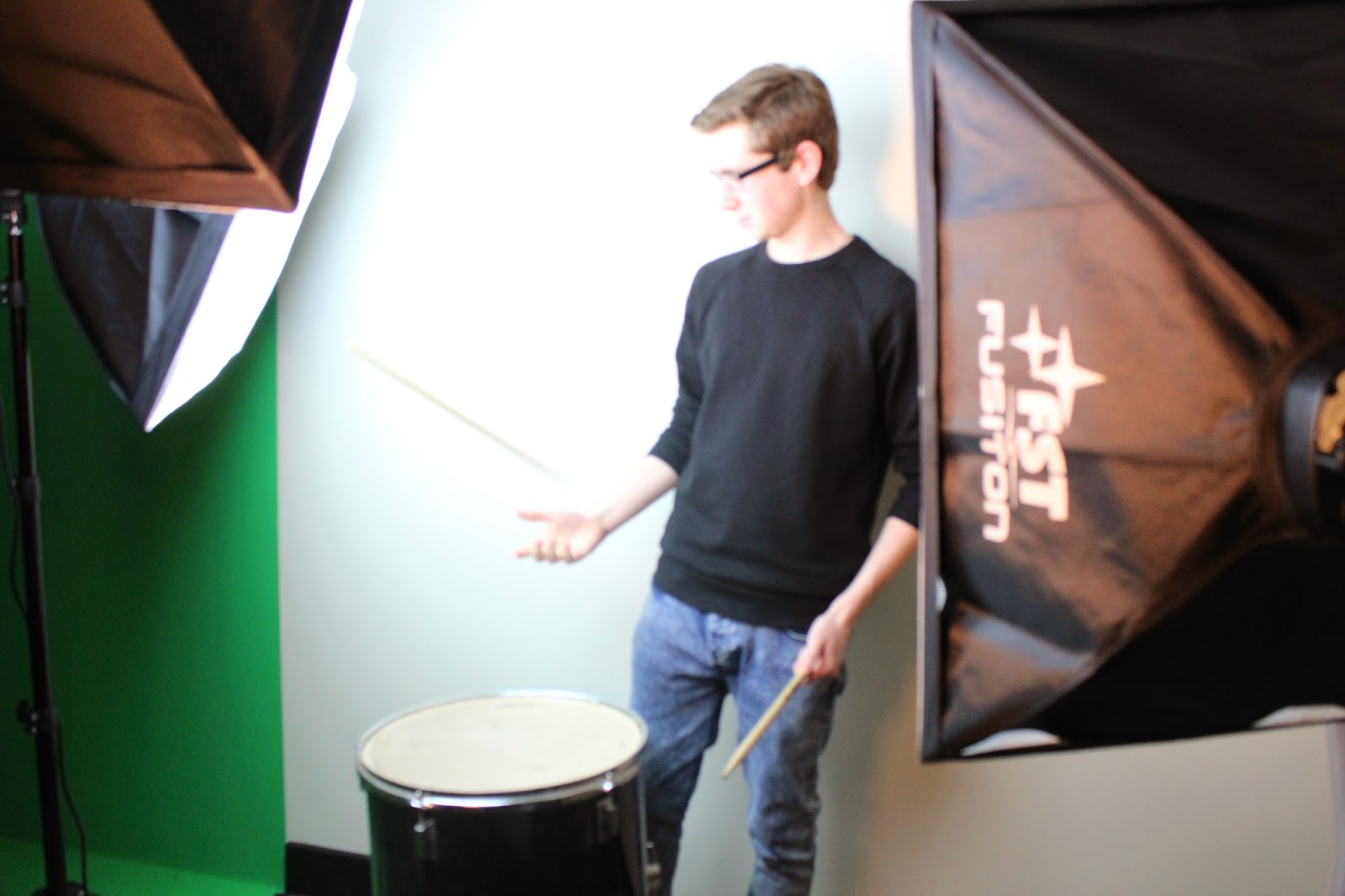
There were unfamiliar technologies I had to learn about though in order for me to create my music magazine. One of these was using a camera. I am greatly inexperienced with camera work and photography. This became a problem because I had to quickly learn how to frame shots. Over time eventually I got better whilst also learning how to correctly light a photo-shoot effectively.
The biggest technology I had to learn about was using photo editing/manipulation programmes such as Photoshop. When first learning about Photoshop, the preliminary task really helped me to get a grasp of it. I frequently practised using Photoshop on both computers and macs in college and on my own laptop at home.
From using Photoshop I have learnt of how to correctly cut parts off photos so I can have the part of the image I need and nothing else.
For example, my front cover with the original main image:
Edited font (top) compared to original font (bottom)
I have used a lot of technologies to be able to create this media product. Some of these technologies I was already familiar with such as Google and word programmes however, there were some technologies I was not familiar with such as photo editing software and handling cameras.
I needed Google for the creation of my magazine mainly for research. By searching for magazines I was able to look at styles of lots of different magazines without actually having to buy anything.
There were unfamiliar technologies I had to learn about though in order for me to create my music magazine. One of these was using a camera. I am greatly inexperienced with camera work and photography. This became a problem because I had to quickly learn how to frame shots. Over time eventually I got better whilst also learning how to correctly light a photo-shoot effectively.
The biggest technology I had to learn about was using photo editing/manipulation programmes such as Photoshop. When first learning about Photoshop, the preliminary task really helped me to get a grasp of it. I frequently practised using Photoshop on both computers and macs in college and on my own laptop at home.
From using Photoshop I have learnt of how to correctly cut parts off photos so I can have the part of the image I need and nothing else.
For example, my front cover with the original main image:
You can see that I have cut out the white background so that the Union flag is visible. I did this by using the "Polygonal tool" and the "Quick selection tool" on Photoshop.
One further thing had to learn about was the use of different fonts. I needed technology such as a computer and the internet to find and download suitable fonts. One problem I had with this however was that some computers in college didn't allow me to download fonts that weren't already on the system. Photoshop enabled me to not only use downloaded fonts but also allowed me to edit them at will. I needed an eroded look for some of my fonts and for my main font I needed it to be two tone and clear too so I
had edited many fonts on Photoshop so that I could get the exact look I was going for.Edited font (top) compared to original font (bottom)
Evaluation Q4
Who would be the audience for your media product?
Here is the link to my GoAnimate video on who would be the audience for my media product
http://goanimate.com/videos/02YgKHj9uF_Y
Evaluation Q1
In what way does your media product use, develop or challenge forms and conventions of real media products?
My media product uses and follows conventions of real media products as well as challenging them.when making my magazine I wanted to follow conventions of real music magazines. This was as well as trying to change some aspects so that my magazine would be slightly different from the rest.
I started by looking at many music magazines and finding ones similar to the magazine I wanted to create. The magazines that I found were most alike what I wanted were Q and NME.

I thought these magazines were similar to mine mainly because
they're focused on targeting British audiences, which is something I wanted (as
my magazine focuses on British rock and alternative). Genre wise, these
magazines were similar to mine too. I didn't want to follow or British rock
magazines like Kerrang or Mojo because that's not the style of music featured
in my magazine. I therefore made sure that I followed conventions belonging to
these magazines. The first thing I followed was the use of a medium close up on
the front cover. I found this is common with magazines f this genre on not only
the front cover but in the double page spread too. Another thing is also looked
at was the placing of my magazine's logo. I needed to put it in the top left corner,
however this was a problem because my magazine's name is six letters long
compared to NME's three and Q's one. There was no way of putting the name on
the top left without it looking squashed, messy and unclear.In my final product
I have the title "ANTHEM" all across the top of the front cover. This
then became a convention I had to challenge.
One further way I have challenged a media
convention is by not using a plain background on my front cover. I have found
that in/on magazines similar to mine, the background on the front covers is
just plain white often with a shadow.
I thought doing this was too simple. Although it is
clearly effective for these magazines within my genre, I don’t think it is
particularly eye catching. I also wanted my magazine to clearly be a British
rock magazine so to me it seemed logical to put the Union Flag (union jack) in
place where the white background would typically be. This also meant I could
follow the convention of having a colour scheme (red, white and blue, with
parts in yellow so the text is clear). The Union flag idea also means that I
can have the convention of a recurring theme in my magazine, this is the use of
a union flag on the front cover, contents page and double page spread.
Thursday, 3 April 2014
More Unused Photos
Many of these photos are fine and in focus, but most of them dont match the ideology of my magazine. I needed to use photos where my cast looked they could belong in a rock magazine, when they looked happy or were smiling it just didn't work and I couldn't use these photo's.
Subscribe to:
Comments (Atom)


.png)


.png)
.png)


+copy.jpg)


